

Step 2 : Directory Layout
Choose a Directory Layout
Section titled “Choose a Directory Layout”In this step, you pick how the directory will look on the front end. Select one of the ready-made layouts that best matches your brand and content. You can change this later at any time.
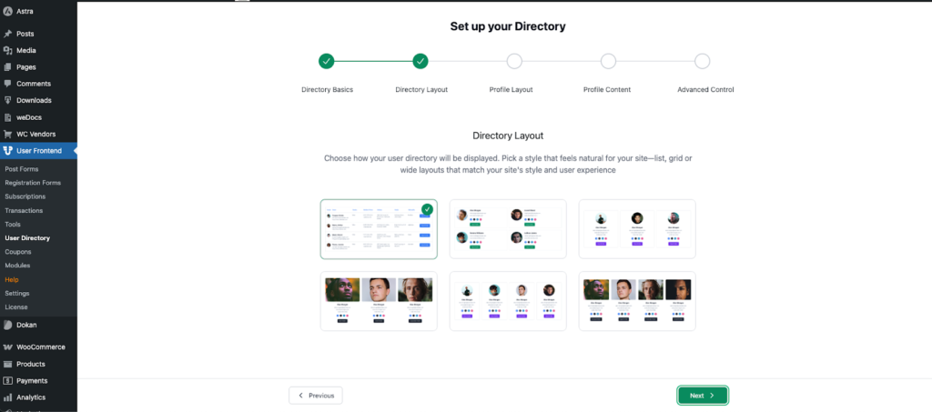
Available layouts (what they’re good for):
- Classic Table – A compact, data-first list. Best when you want to show many users with key info in rows (teams, member lists).
- Rounded Sidecar (2×) – A card with an avatar on the side and details next to it; shows two cards per row. Great for speakers or profiles with short bios and action buttons.
- Round Grid (3×) – Circular avatars in a three-column grid. Good balance between photos and text.
- Square Grid (3×) – Square avatars/cards in a three-column grid. Works well when images vary in size.
- Round Grid (4×) – Circular avatars in a tighter four-column grid; ideal for image-heavy directories with many users.
- Square Grid (4×) – Square avatars/cards in four columns for maximum density while staying clean.
How to proceed: click the layout you like (a checkmark will appear), then click Next. All layouts are responsive and will adjust for mobile automatically.