How to Make Your WooCommerce Site Mobile-Ready with 9 Simple Steps
Making your WooCommerce site fitting into the mobile screen is easy. However, most WooCommerce owners don't know how to do it in the right way. Also, there are many of us who don't understand why it is so crucial.
WooCommerce powers over 28.19% of all online stores. 22% of the top 1 million eCommerce sites use WooCommerce.
Hosting Tribunal
People's shopping tendency has changed throughout the last decade. Uses of the internet via smartphones reshaping their behavior. Hence, if you have a WooCommerce online store, it's high time you must turn your site design and features well-fitted into any kind of screen.
Well, we are here to help. This blog is going to be the ultimate guide to developing your WooCommerce on mobile. Let's get started.
What Makes a WooCommerce Site Mobile-Ready

A site that is ready to be viewed on a smartphone or tablet. The whole site fits on the screen, scrolling right to left is not required, and the text and pictures re-flow and re-size dynamically.
Brian Coale, Casey Printing
Besides the desktop or laptop screen, a mobile responsive website is accessible with all the necessary features on smartphones or tablets screen. However, you will find a handful of similar terms in this regard. You may be also heard of these words – mobile-first, mobile-friendly, or adaptive design.
All of these terms go for the same goal, making better visibilities of your website on mobile.
However, you can build a mobile app, and take all of your mobile customers there. Also, the adaptive design implies developing different versions of your website to fit into any screen. On the other hand, when you develop the mobile user experience in your site, you can call this approach mobile-friendly.
The Rise of mCommerce and Importance of WooCommerce on Mobile
The number of worldwide smartphone users was projected to reach 3.5 billion last year. And, it is on course to reach 3.8 billion in 2021. If you compared the number, it was 2.7 billion in 2017.
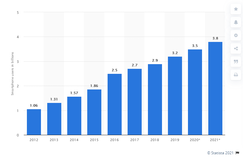
The high curve is ever-growing, and there are no sign of slowing down. As billions of people using smartphones, evidently the rise of mCommerce was eventual. People love to do shopping from their mobile compared to desktop or Laptop more than ever.
Business Insider forecasted that by the end of 2020, m-commerce will reach $284 billion. Which covers almost 45% of the total U.S. e-commerce market. Therefore, the post-pandemic era brings changes to people's shopping behavior.

If you see the above chart, you can easily understand the percentage of retail eCommerce sales will increase to 18.1% from the last year's 14.5%. It is predicted by Insider Intelligence that m-commerce volume to touch 25.5% compound annual growth rate (CAGR) that is 44% of total e-commerce sales by 2024.
Hence, all of these stats and data implying only one thing.
If you have a WooCommerce website, and you want all the mobile visitors can easily shop in your online store, what's the best way? You must develop a mobile-ready experience for them.
How to Develop Your Mobile-Ready WooCommerce Site
- Let's Run a Quick Check on Google Mobile-Friendly Test
- Start Optimizing Your Images
- Rethink About Your Lead Generation Popup
- Start Using a Mobile-Friendly WordPress Theme
- Develop a Simple Menu and Site Navigation
- Go for Mobile-Optimization WordPress Plugin
- Increase Your Page Speed
- Keep Your Site Design Simple
- You need the Simplest Checkout Process
1. Let's Run a Quick Check on Google Mobile-Friendly Test
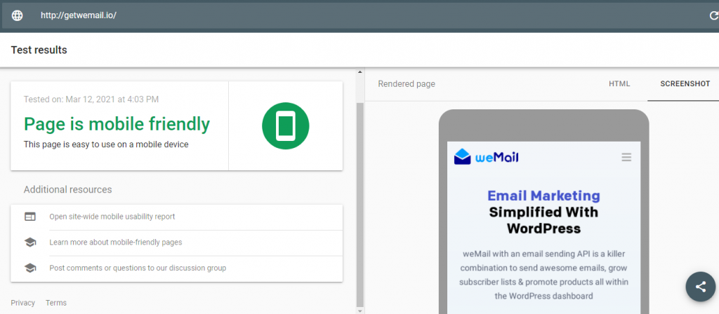
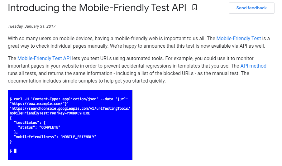
The first thing is to find out how much your WooCommerce site is mobile-ready right now. Hence, the easiest way would be to take a Free Google mobile-friendly test. This is super simple.
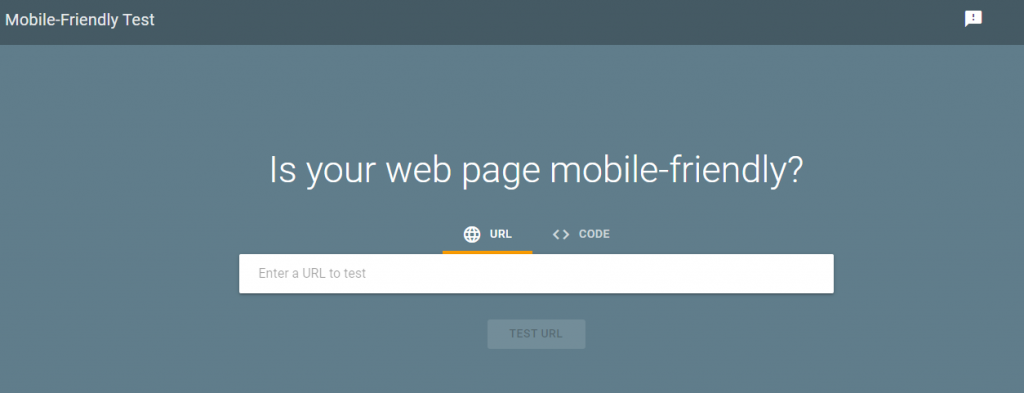
What you need to do is go to the Google Mobile-Friendly test page, and put your URL there. You will see either your website is mobile-ready or not. The blue color will indicate that you are good to go. If you see the red color, surely you have to take the right measures. It also shows the preview of how your site will look in the mobile screen.
Therefore, Google releases a special mobile-friendly test API for developers. If you are a developer, you can accomplish two things with this automated tool. They are –
- Test more pages so quickly
- Monitor the most important pages on your site, and you won't be needing manually turn your browser tool.
2. Start Optimizing Your Images
Product images can be the biggest growth factor for your business. More than 75% of online shoppers attracted by product photographs before shopping. So, this strategy should inseparable from your WooCommerce store.
But here's one thing is very crucial. Images are good for your customers, though they also keep consuming space. As a result, too many images need a bigger server and a longer time to load. It can hamper your page loading speed.
Moreover, a slow site becomes slower in mobile. Also, if the high-resolution images are not optimized for small screens, your customer will see only a fragment of the images or blurred version.
The best way to get rid out of this problem is to use an image optimization tool. For our websites, we use a very simple and powerful photo optimizer Tiny PNG.
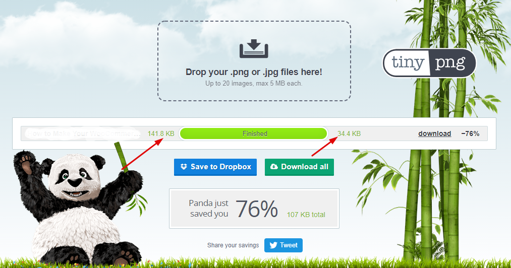
However, there are many other ways to apply image optimization for your WooCommerce on Mobile. You can install an automated image optimizer WordPress plugin. Also, you may get help from Lazy Loading. When any of your visitors come to your website, the feature tells the user's browser not to load any images until they are necessary. This help user to experience a faster landing page, and the images get the proper time to load.
You will find a handful of reliable lazy loading plugins in the WordPress Repository.
3. Rethink About Your Lead Generation Popups
Popups are proven ways to lead generation. And, maybe one of the most used channels to increase sign-ups and newsletter conversion. However, if you run a survey amongst your site visitors either they love it or not, most likely they tell you this: popups are annoying. Despite that fact, the top 10% highest performing popups convert on an average of 9.28%.
So, you should use popups. But with a plan. Because they also make your site heavy. Therefore, on mobile screens, popups can blunder the user experience, which eventually leads to a high bounce rate.
You may have already experience the thing while visiting a website by using your mobile phone. It's totally a mess sometimes, when the popups blocking your way to see the content completely, therefore also they can act weirdly. For example, you try to remove them, but they won't or you can't even found the option to remove them.
That's why it would be a good thing if your WooCommerce site has a lesser number of popups. Moreover, you should use a minimalistic one. Also, to make your site more mobile-ready, you can remove the popup, and place it as a sticky form at the bottom of the webpage.

4. Start Using a Mobile-Friendly WordPress Theme
This is one of the vantage points of WordPress is so popular. It is open, and you can do almost anything to make your website flexible. So, if you built your WooCommerce store on WordPress, there are a lot of options to make it mobile-ready.
One of the best ways would be choosing a mobile-friendly WordPress theme. While designing your online store, you can find a WordPress theme that's mobile outlook is better compared to others.
WordPress has hordes of responsive themes nowadays. Even those are not, or have a lack of its design, regularly publish updates. So, if your current WordPress theme isn't mobile responsive, check for the latest updates in the first place. If still, they look bad on mobile, it's high time you should go for a more mobile-friendly lightweight WordPress theme.
5. Develop a Simple Menu to Make Your WooCommerce Site Mobile-Ready
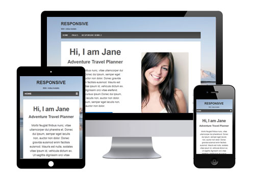
On the phone screen, it's a bit hard to navigate a complex menu, or it is less comfortable. For example, check the two different looks of a website below.
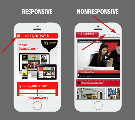
The first screen is mobile-ready. So you see the navigation menu is on the top right side. It will only expand when any visitors click on it. On the other hand, the second screen keep almost every element a browser could show us. All the tabs consuming the screen, a lot of content saturated the landing pages, etc.
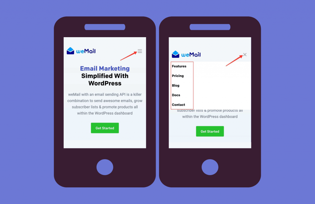
You can simply look at the image above. The menu is simplified. You just click on it, you will see all the necessary pages. However, you can design your WooCommerce store as you want. But keeping your menu and navigation simple would turn your site into a mobile-friendly one.
6. Go for Mobile-Optimization WordPress Plugin
Mobile optimization plugins help your online store to become more mobile-ready. Maybe this is one of the easiest ways to turn your user experience better for mobile users. Besides, all the action you can take from the aforementioned ways, this types of plugins only make your job easier.
If you already are using a mobile responsive WordPress theme, there still could be some problems you might face. There are alignment issues, slow loading, inconsistency in the overall responsiveness. It happens, because, updates are a complex process. Sometimes, they don't act as they designed for a WordPress theme, and it takes time to fix those issues.
Therefore, to stand as a backup for your WooCommerce store's mobile-ready appearance, you can install and activate a mobile optimization plugin. Furthermore, these types of tool can take care of your social sharing from mobile, track mobile user interaction, and many more things.
Hence, you will find a lot of plugins in this regard. Some of the popular names are – Jetpack, WordPress Mobile Pack, AMP for WP, Responsive Mobile Menu, etc.
7. Increase Your Page Speed for Mobile Users
Speed is definitely a ranking factor? YES.
John Mueller, Google
You should directly take steps to increase your WooCommerce stores' page speed. On average, 53% of mobile visitors left a website if it takes more than 3 seconds to load. On a different opinion, a 2-second delay can increase your bounce rate up to 87%.
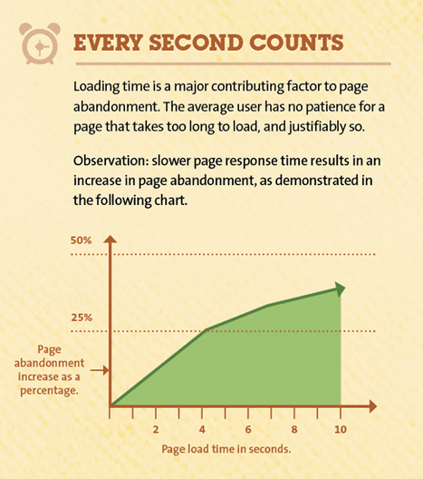
So, evidently people are on a rush while visiting a website by using their mobile phones. And, if your page speed isn't compatible with the ideal loading time, you should take the necessarry steps as soon as possible.
To begin measuring the page speed of your online store, you can use the following tools whichever seems fit –
Google PageSpeed Insights
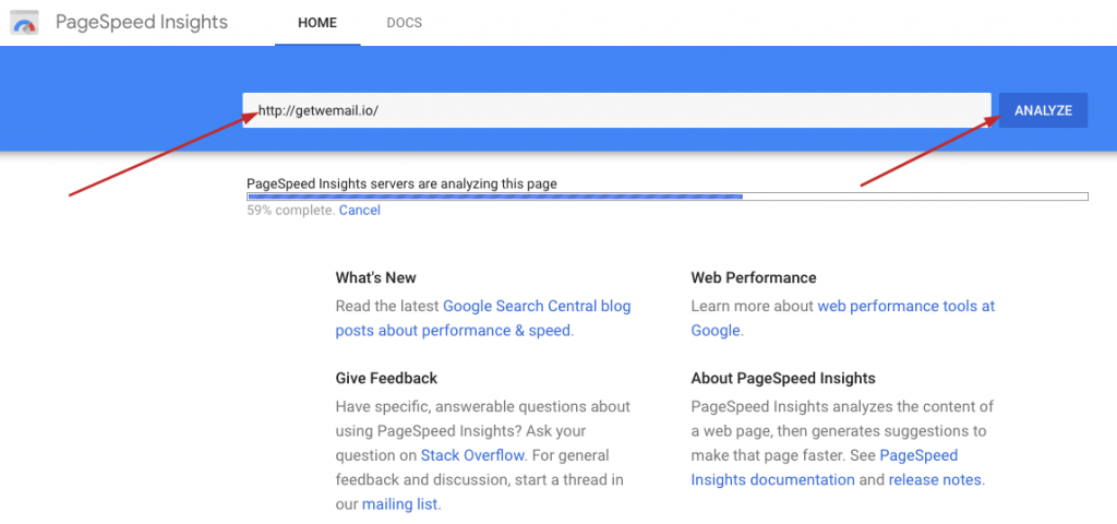
After the tool analyzed your page speed, you will be seeing a detailed report which will give you a combined score, average time of loading, first and largest contentful paint time per ml second, etc. Also, it will give suggestions to make your page faster.
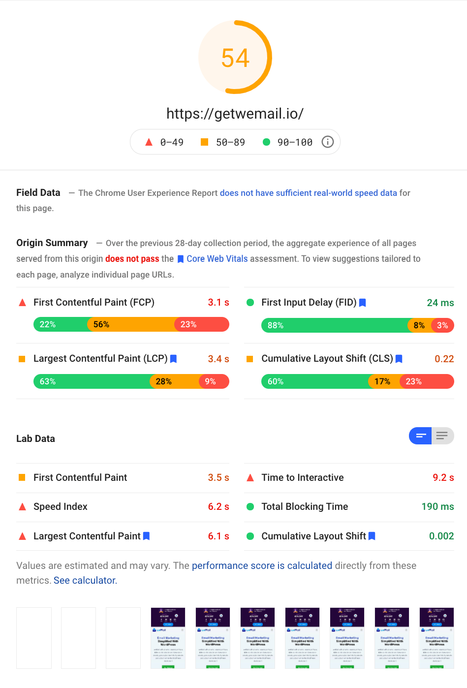
Here, you must remember two things. One, the bigger the score the better is your page speed. But only a lightweight website gets a bigger score. Two, the bigger database your site consumes, the score would also be lower. You have to take steps following the size of your WooCommere store.
GTMetrix
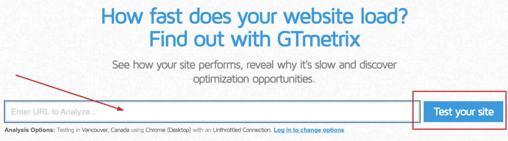
This tool gives you a more wide range of data set when you analyze your WooCommerce site with it. It could be a compatible alternative to Google PageSpeed Insights.
8. Keep the Site Design Simple
Apart from all of the tips we have given above, it's the most crucial step. A common phrase you may be well remembered of, ‘the simplest things are the hardest to accomplish.' However, the more you make your site design easy to navigate, cut out the crap, remove extra elements, and only focused on your goal, the more will be your WooCommerce site mobile-ready.
To do this, you can follow the below tips –
- Visit and examine all the major WooCommerce websites around the world.
- Choose the simplest WordPress theme possible.
- Your layouts shouldn't be over-saturated.
- Choose theme color, and maintain the tone.
- Make your site guiding to a visitor into a customer. Don't create a promoting one.
Therefore, our advice is you shouldn't follow Amazon or eBay's design. As they are giants and have their own network and resources to make their over-saturated site faster loading. Also, they have their own kind of business ethics and system which is harder to grasp or accomodating for you.
Hence, you understand your business and prospects better than anyone. That makes you worthy to develop your own design pattern which is simple and helps you to accomplish your goals.
You may also like: Top Websites Using WooCommerce for eCommerce
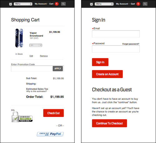
9. You need the Simplest Checkout Process for a Mobile-ready WooCommerce
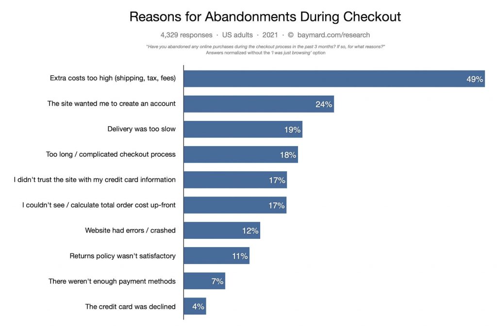
The checkout process often gives users a hard time. According to a Baymard report, 18% of users abandoned a cart due to a lengthy checkout process. While 7% of users do the same when they won't found enough payment methods. Besides that, 17% of them also complained that they couldn't able to calculate or see the order-cost upfront. That's combined almost fifty percent of users left cart because of the complexity of the checkout process.
So, when you want your user to checkout from their mobile phone, the process should be easier. You can follow the tips to make a simple checkout process for your mobile-ready WooCommerce site –
The Basics of Transparent Checkout Process
- Go for a CTA button that is visible and alluring. In this part, you surely can follow amazon.
- Try to give enough product details and information so that the customer understands everything before they proceed.
- Keep your transaction process transparent. It means you show the detailed breakdown of the cost your customer is going to pay like – delivery charges, vat, and taxes, etc.
Developing a Mobile-friendly eCommerce Checkout System
Derek Nelson, Creative Director of Clique and a Contributor of Smash Magazine found a handful of way that can help you develop a better checkout process for WooCommerce on mobile users.
He suggested, you should ask for a minimal information in the checkout process. It allows you to include only the vital fields.
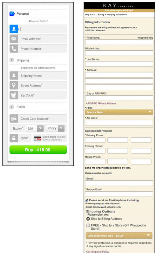
Then, approving the guest payment option would bring better results. That means random visitors should directly purchase from your WooCommerce site without even registering. This can lead up a major growth for your business. As, register button often hampers a transaction, and UIE tested the case for a major eCommerce brand, and removing only the Register button brings that brand a huge jump in sales.
Furthermore, you should put the information in the process, and remove all the distraction like small notes, or advertisement in the checkout page. And show payment progress step by step to the customer would be more trustworthy idea.
However, to create a strong mobile-ready checkout process, you can read our well-researched blog on Effective Ways to Reduce Shopping Cart Abandonment.
Closing Up for Developing Your WooCommerce Site Mobile-Ready
From the very beginning of your WooCommerce venture, you should keep the idea of a mobile-ready website. If you do so, it will save both your time and money. Therefore, you can follow the tips one by one and do your research regularly in this regard.
However, we believe now you can understand the importance of building a WooCommerce store that is highly accessible to mobile users. To help you out with a mobile-ready WooCommerce site, Dokan Multivendor would be one of the most powerful solutions. You can check out some of the brands successfully running their eCommerce shop with Dokan.
If you may face any issues while applying any of our tips, don't forget to inform us. We are here to help. Always.