


We Tried 7 Conversion Rate Optimization Strategies – Here’s What Actually Happened
I have spent years running eCommerce stores. Traffic was never my biggest problem. Getting that traffic to convert? That’s where things got messy.
I kept reading about conversion rate optimization strategies, but most advice out there felt like copy-paste tips. They have only used guesses, there were no proofs.
So I decided to test things myself.
I picked 7 CRO strategies. Real ones. Not the usual ‘just write better CTAs‘ advice. I ran each one on my own store. Tracked everything. Tweaked. Watched what worked, and what totally flopped.
And now, I’m sharing the whole thing with you. Let's dive into the deep!
What Is Conversion Rate Optimization?
Conversion Rate Optimization (CRO) is about turning visitors into customers. That’s it.
You can throw money at ads all day, but if your site can’t convert, you're just burning cash. CRO is the process of improving your site so more people take the action you want, buying, signing up, adding to cart, whatever matters to your business.
It’s not about guessing. It’s about testing changes and tracking results. You can get better results through small tweaks, smart decisions, and constant learning.
And no, it’s not just for big stores with massive budgets. I’ve seen CRO make a noticeable impact even on small sites with just a few hundred visitors a day.
So if you care about sales (and not just traffic), CRO is something you need to care about.
What Is a Standard eCommerce Conversion Rate?
There’s no single “perfect” conversion rate. But there are some solid benchmarks. Most eCommerce stores see a conversion rate somewhere between 1% and 4%.
If you're below 1%, something’s likely broken. If you're above 4%, you're doing something right, or selling something people really want.
But here’s the catch: industry averages don’t tell the full story. Conversion rates depend on a ton of things:
- your niche,
- your product price,
- your traffic source,
- your customer base, and
- even the time of year.
A store selling impulse-buy products will convert very differently from one selling $800 espresso machines.
So don’t stress over hitting a global average. Just know where you’re starting, and aim to improve it one change at a time.
How to Calculate eCommerce Conversion Rate?
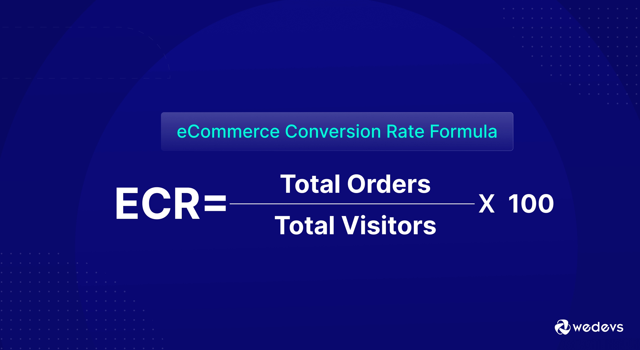
The formula is dead simple:
eCommerce Conversion Rate = (Total Orders ÷ Total Visitors) × 100
So if you had 500 orders from 20,000 visitors last month, your conversion rate would be:
(500 ÷ 20,000) × 100 = 2.5%
Some platforms calculate this for you. But I still like to do it manually once in a while. Helps keep your eyes on the real goal, turning traffic into buyers.
You can also break it down further:
- Product page conversion rate
- Cart-to-checkout rate
- Checkout completion rate
Each tells you where people drop off. And that’s where the real optimization starts.
Prerequisites – How I Prepared My Store for Implementing CRO Strategies
I ran these conversion rate optimization strategies on one of my mid-sized eCommerce stores. We sell physical products, nothing too niche, nothing too broad. The kind of store most people can relate to.
Before testing, our average conversion rate hovered around 1.5%. Not bad, but definitely room for improvement.
Here’s how we approached it:
- Test period: 5 weeks
- Traffic sources: Mostly organic and email (some paid traffic too)
- Tools used: Just Google Analytics, native store analytics, and manual tracking. No fancy CRO tools.
- Metrics tracked: Add-to-cart rate, cart abandonment, product page CTR, and of course, final purchases
Each strategy was tested one at a time. That way, we knew what actually caused the changes.

7 Conversion Rate Optimization Strategies We Tested
I didn’t pick these strategies from some generic list. These are based on patterns I’ve seen over time, things I always suspected could move the needle.
Some were simple layout fixes. Some needed a bit more effort. But all were practical, measurable, and worth testing.
- Simplified the Checkout Flow
- Added Social Proof Throughout the Funnel
- A/B Tested Product Images and Descriptions
- Added Exit-Intent Offers (Without Being Annoying)
- Improved Mobile UX for Faster Load and Easier Navigation
- Changed CTA Button Text and Placement
- Sent Abandoned Cart Emails
Let’s break them down, one by one!
01. Simplified the Checkout Flow
Our checkout used to feel like a form from 2009. It asked for everything – name, email, phone number, shipping info, account creation, billing details, etc.
One major friction point? That “Create an account to continue” prompt. It killed conversions. A lot of visitors bailed the moment they saw it.
So we cleaned it up:
- Made guest checkout the default
- Reduced the form fields
- Autofilled addresses where possible
- Showed a clean progress bar at the top
After that, we saw a positive growth in the conversion rate. This proves that the fewer steps people jump through, the more likely they’ll hit the ‘Place Order' button.
02. Added Social Proof Throughout the Funnel
We already had a few product reviews here and there, but they were buried. Most visitors never saw them.
So we made social proof part of the journey, not just the product page.
Here’s what we did:
- Moved star ratings and review counts right under product titles
- Highlighted customer photos just above the Add to Cart button
- Added a “What customers are saying” strip between product features
- Showed trust badges and testimonials on the checkout page
After doing these tweaks, we have seen a positive growth in the add-to-cart rate.
Add-to-cart rate improved by 11%. But more importantly, bounce rate on product pages dropped by 18%.
Turns out, people don’t just want to know the product is good. They want to know others bought it, loved it, and had a good experience.
03. A/B Tested Product Images and Descriptions
We thought our product pages looked good. Clean images. Short descriptions. All the basics were there. But when we tested variations, the results surprised us.
Here’s what we tried:
- Lifestyle images vs. plain white background
- GIFs showing product in use vs. static shots
- Bulleted benefit-focused copy vs. paragraph-style descriptions
- Short descriptions above the fold with expanded details below
Among all these experiments, ‘lifestyle images + bullet points' was a winner.
Products with real-life context drove 16% higher click-through to checkout, and bullet-style benefits got read more. People don’t want fluff—they want clarity and visual confidence.
04. Added Exit-Intent Offers (Without Being Annoying)
Let’s be honest, most pop-ups are annoying. I’ve clicked out of them myself more times than I can count.
But we were losing visitors at checkout. So we tested exit-intent offers, the kind that only appear when someone’s clearly about to leave.
Here’s how we approached it:
- Triggered the pop-up only once per session
- Showed it only on the cart and checkout pages
- Offered a small discount or free shipping
- Made it easy to close, no tricks
We didn’t interrupt shoppers. We just gave them one last nudge, right before they bailed. Exit-intent works. Just don’t be desperate or aggressive about it.
05. Improved Mobile UX for Faster Load and Easier Navigation
More than 70% of our traffic was coming from mobile. But conversions on mobile were way lower than on desktop.
So we dug in and yeah, it was messy.
Pages took too long to load. Menus were clunky. Buttons were too close together. Even zooming in on product images was a pain.
Here’s what we fixed:
- Compressed images without killing quality
- Simplified the navigation menu
- Made CTAs bigger and spaced them out
- Enabled swipeable image galleries
- Reduced unnecessary scripts that slowed load time
Speed and ease, two things mobile users absolutely expect. We were holding ourselves back without even realizing it.

06. Changed CTA Button Text and Placement
We used to play it safe with CTAs. “Add to Cart.” “Buy Now.” Standard stuff. The buttons were there, but they didn’t stand out, and they didn’t say much.
So we experimented.
Here’s what we tested:
- Button color: Neutral vs. bold (we went bold)
- Position: Moved CTAs higher on mobile and repeated one at the bottom
- Text: Replaced “Buy Now” with specific phrases like “Get Yours Today” or “Grab It Before It’s Gone”
The ‘Bold buttons + urgency-based copy' worked better. Especially on mobile, moving the button higher made a clear difference.
CTAs shouldn’t blend in or sound robotic. They need to pop and tell people what to do, fast.
07. Sent Abandoned Cart Emails
We had an email system in place, but abandoned cart emails weren’t a priority. Big mistake.
People were adding products, then disappearing. So we set up a 3-part abandoned cart email sequence.
Here’s how we structured it:
- Email 1 (sent after 1 hour): Quick reminder, no discount
- Email 2 (sent after 12 hours): Highlighted product benefits + reviews
- Email 3 (sent after 24 hours): Gave a small and limited-time discount
Open rate: Over 40%.
Recovery rate: Around 10.8% of carts were recovered.
We didn’t get aggressive. Just helpful nudges that reminded people what they left behind, and why it was worth coming back for.
Lesson: If you're not following up on abandoned carts, you’re literally leaving money on the table.
What Conversion Rate Optimization Strategies Actually Worked (And What Didn't)

Not every strategy was a home run. Some made a huge difference. Some barely moved the needle.
Here’s the breakdown:
Big Wins
- Simplifying the checkout flow had the most noticeable impact. It directly boosted completed purchases.
- Improving mobile UX had another big impact. Most of our visitors were on mobile, and once we fixed the pain points, they started converting.
- Abandoned cart emails brought in real, measurable revenue that we were losing before.
Moderate Impact
- Social proof helped reduce bounce and kept visitors engaged, but it worked best when paired with strong product pages.
- CTA tweaks improved click-throughs, especially on mobile, but didn’t always translate into more purchases unless other parts of the funnel were tight.
Low Impact
- A/B testing images and descriptions gave us some lift, but not every change made a difference. Some variations confused shoppers more than they helped.
- Exit-intent offers worked, but only on a small segment. We kept them because the win was still worth it, just not massive.
eCommerce Conversion Rate Optimization Strategies – Key Takeaways for Your Store
I have prepared a list of key takeaways for your eCommerce store. Follow these conversion rate optimization tricks to improve your sales!
- Simplify everything: From your checkout to your product pages, less friction means more conversions.
- Mobile is your biggest opportunity: If your site isn't fast and easy on mobile, you're leaking money.
- Don’t ignore the obvious: Clear CTAs, faster load times, and smoother UX beat clever hacks every time.
- Social proof builds trust fast: Real reviews and customer photos are worth more than ad copy.
- You don’t need fancy tools: We ran all these tests without any premium CRO software. Analytics and logic got us far.
- Every store is different: What worked for us might not work for you. But testing will always beat guessing.

Which Conversion Rate Optimization Strategy Are You Gonna Implement?
We didn’t reinvent anything. We just stopped guessing and started testing.
These conversion rate optimization strategies weren’t flashy. But they worked. Because they were based on real user behavior, not assumptions.
Some changes took 10 minutes and some took a weekend, but all were worth it.
If you’re running an eCommerce store, don’t wait for a perfect CRO strategy. You can start small, but you should track everything. And definitely fix what’s clearly broken.
The results will follow. Happy selling!