


How to Use Forms for Enhancing UX In WordPress
Everyone hates forms. That's certainly not a secret. But why is that the case? Forms are not green chilies, they are not mosquitoes then why on earth these pages with simple little boxes are hated so much. What makes forms so annoying?
Why so much hate for forms?
The biggest problem with the forms is that they sit right in the middle of getting something done. You want to comment on a blog, a form will pop up out of nowhere asking you to register first. You want to order something online, a form is there to stop you demanding you to sign in first if you really want to get your hands around this sweet thing. Take it like this way, form; it is like that big fat bouncer standing at the gate of that infamous nightclub everyone is talking about.
Well, to be fair, forms receive so much hate for something they are not truly guilty of. It is the process connected to the form that makes them annoying. As a website owner, especially as an eCommerce entrepreneur, forms can prove to be a silver bullet as they greatly affect the buying experience. An optimized and carefully crafted web form not only acts as a tool for capturing valuable information about potential customers but can also act as a catalyst to speed up the conversion process.
However, the problem with some webpreneurs is that they put very little emphasis on improving forms. For them, a form is just a form and there isn't pretty much they can do about it. That is a total wrong approach. Experts believe that time and time again you must do a form testing to analyze if your forms can be improved. A/B testing of forms can be a great idea as it gives you the opportunity to compare even slightly different designs and concepts you have the chance to optimize step by step.
Form Design Best Practices to Improve UI and UX
There is no debate in saying that form is the most important component of the sales funnel. So, you need to make sure that your forms are easy impressive, and sleek. While many websites fail to optimize their forms for usability, in this article we are going to highlight some of the best form design practices along with some overlooked opportunities to maximize your form fields to achieve an exceptional user experience and take your sales to whole another level.
Establish Trust
Another reason why forms appear so annoying is that they are often misunderstood. It is important for you to clearly declare the purpose of the form and how filling it would BENEFIT the user. Moreover, users are highly concerned about the information they provide so you must also ensure that their info is safe and how it will be used by you.
It is a good practice to deploy Google Captcha or google reCAPTCHA as they prevent web forms from spam abuse. The fear of being spammed is removed and the user is more comfortable to fill it out. There are a lot of forms available for WordPress and WooCommerce that are powered by Google reCaptcha. In the image below is an example of such a
WooCommerce registration form that has deployed Google reCaptcha and the user can verify only by a click.

Simplify and Remove Friction
The ideal way to simplify your forms and remove friction is to think like a user. Analyze the spots that can cause hindrance and communication barrier. Countless studies indicate that the more information you ask from your users, the less likely they are to give it to you, so you are the risk of losing a ton of conversion.
Ask only for what you truly need. This is something you should do right away. Strip down your forms to a minimal. The length of your form is directly proportional to the drop off rate. The longer your forms are, the higher the drop-off rate. Neil Patel reveals that he was able to increase conversions by 26% by removing just 1 field from his contact form.
One great way to cut down on the steps is to allow people to log in via google, FB or twitter. This way, customers don't have to put their emails and username and friction are automatically removed.
In short, your web form philosophy must be based on the idea of minimalism that “less is more” is what you should continuously put it into practice while designing the user interface of forms.
Keep your forms as short and possible and never ask for information the user think you don’t need.
Single-Column Layout Out Performs Multiple-Column Layout
Single column layout delivers better results as it keeps your customers off confusion. A study by CXL Institute found that Single-column forms are faster to complete.

Here is the Summary of the survey conducted be CXL:
“Survey participants completed the linear, single-column form (n = 356) an average of 15.4 seconds faster than the multi-column form (n = 346). This was significantly faster at a 95% confidence level.”
The survey further indicated that multiple column layouts create confusion about which field is to be completed first. So, if there is only one input field per row, there is no confusion at all. The speed of the process will automatically increase hence the frustration of the user, will be lower.
In addition, the single layout also reduces eye movement as users only need to look one way instead of looking all around.
Create Multiple Steps Form Filling
Another innovative way to keep users intact and make forms less aggravating is to split your forms into multiple steps. Multi-step web forms out-perform generic single-step forms as the first impression is less intimidating. There are only 2, 3 fields in the first step. The customer gets trapped which gives you the opportunity to ask for sensitive information in later steps as the customer has already come a long way so he/she won't want to lose the progress.
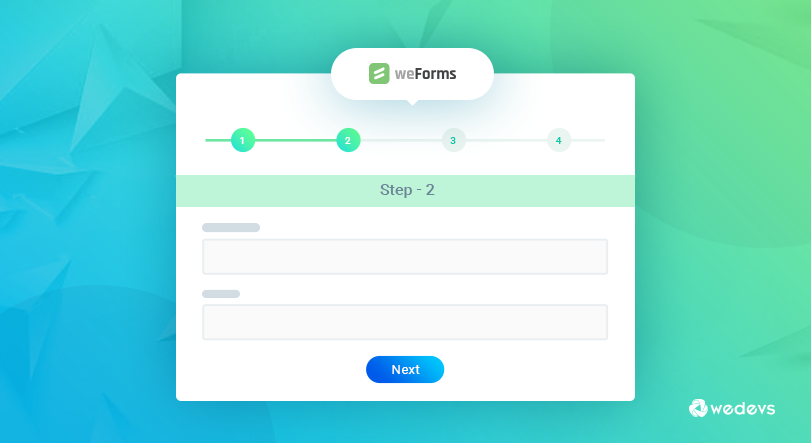
Additionally, the progress bar also motivates the user to complete the form. Multiple steps forms are easy to digest, however; they can be troublesome if the internet connection is slow and the steps will take longer to load. So, it is also important to keep the pages clean and optimized for slower connections
Use inline form field validation
Inline form validation makes sure that the user puts valid information as he/she moves around the form. For instance, if someone inserts an incorrect phone number, a red text will appear in real time indicating that the information is erroneous instead of first submitting the form and then learning that a field was filled wrong.
According to Baymard Institute, here are some benefits of inline validation,
- It makes it easy for the user to locate error. Users are pointed to errors immediately so there is no hassle and users get more comfortable.
- Positive inline validation increases confidence. It instills a sense of progression and accomplishment as the user “successfully completes” each field and the site provides them thumbs up with encouraging visual feedback after each and every step.
- As the users are alerted to the input being invalid right after typing it the field context is still fresh in mind so the amount of time needed to correct it decreases significantly.
Ensure that the browser can auto-fill
Thanks to Google Chrome and Firefox, filling out forms today is much simpler, faster and easier than it was ever before. It is because these browsers can fill the information for you by themselves. As per Google’s research auto-filling helps users fill out forms 30% faster.

However, for this strategy to work, you must create easily distinguishable context clues, like “Country” or “First Name”. You can consider using auto-fill city and region based on geolocation. Also, can get it from their account if the user is already registered. However, always leave the fields available for editing to give control over the process.
Use Right CTA’s
People often overlook Call to actions. Clear and definitive call to actions can bridge the communication gap and persuade the user to complete the process. Failing to optimize is CTA’S is one reason why so many marketers fail to turn traffic into conversions.
Here are some ways to optimize web forms CTA’s
- The size, color and text length of your CTA button has a significant impact so make sure you create a balance.
- CTA button should align with your overall brand voice and tone.
- It’s a good practice to entice people with offers of “free” stuff. Language can play a big part in form completion. It obvious that a form that says” Get a Free Guide Instantly” will get a better response than a generic Sign Up”
- Create a sense of urgency. Using text that offers something short amount of time or creating scarcity with limited supply can certainly be a great motivator for action.
Conclusion
Forms are the most critical part of any online business revenue. So, it important to regularly conduct A/B testing and check for market trends while designing or restructuring. Also, make sure that your forms are mobile-friendly. As mobile usage has officially surpassed desktop usage, you can lose a good number of leads if your forms don't align with mobile devices and other viewports.
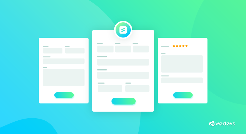
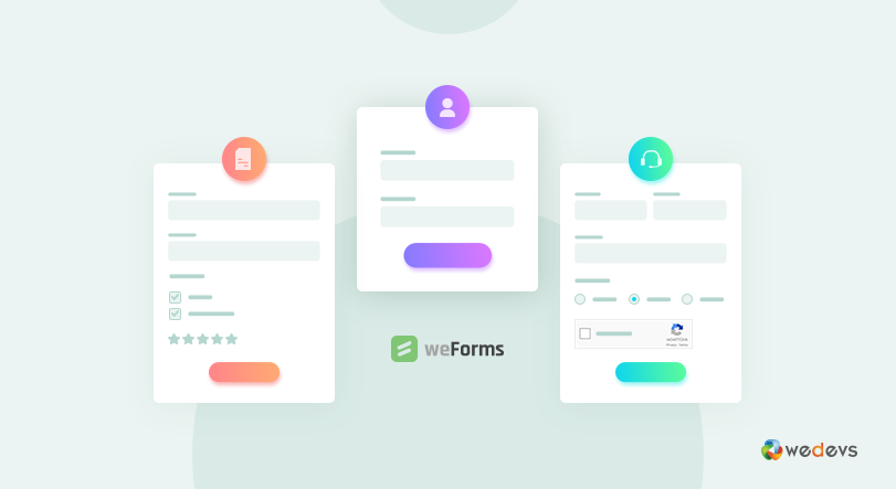
Also, if you are looking for contact form plugin to improve UX in WordPress, then you should go for weForms. It is currently the fastest form builder plugin for WordPress that would make using forms to enhance UX for WordPress faster than ever.
This is a guest blog from Asad Ali, a digital marketing expert having more than 8 years of experience in eCommerce SEO, search engine marketing, social media optimization, and user experience. He is currently working at GO-Gulf, that is a premium Dubai web design company.